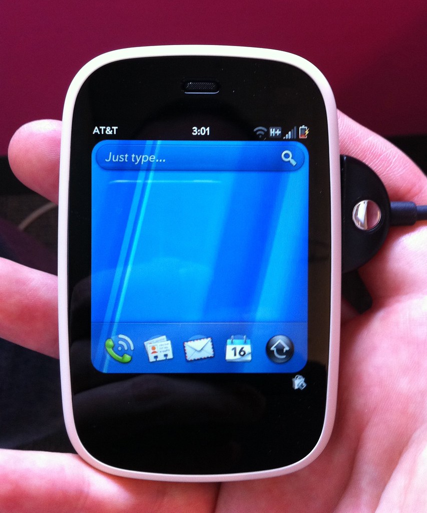
Thanks to my awesome co-worker Kristy (of GeekSugar fame), I was able to borrow the new HP/Palm Veer phone this week. For those of you who are unaware, the Veer is the newest webOS phone from Palm, and the first to be released since they were acquired by HP last year. And the signature feature of the Veer is that it's tiny. Really tiny:
And as I have done with past devices that I have borrowed from work, I'm going to attempt to do a review. I'm going to cover all of the aspects of the Veer and webOS that were relevant to me, which might not delve into what you're looking for. So if you want to know more, you should definitely check out Joshua Topolsky's review. There is also an interesting discussion of the Veer on the latest episode of "The Talk Show", starting at minute 53.
TL;DR version: If you're in the market for a smartphone that isn't an iPhone, and you don't think that you're ever going to want to listen to music on said phone, the Veer might be worth a look. However, due to the poor experience with the headphone jack, and high price (compared to the iPhone 3GS), I really can't recommend this phone.
Continue after the break, if you want to know more. Much, much more.
The Veer Hardware:
According to HP, the small size of the Veer shouldn't translate to a lack of functionality. The phone has a 2.6" 320x400 multitouch display, an 800Mhz CPU, 512Mb of RAM, and 8GB of flash storage. But it's the size of the Veer that is easily it's most impressive feature. It's hard to describe how small it is — you just have to hold it in your hand to see. It's so small, that I was frequently worrying about losing it. I don't think it's possible to make a phone much smaller (maybe you could do this size, but thinner). I did like carrying it around, and as I have shifted more of my non-Mac time to the iPad, I could see have a smaller, less powerful phone that is something of a "tablet companion". That being said, I think that for all-around use, the 3.5" display in the iPhone is probably the sweet spot, in terms of still being pocketable, yet providing a good size for use. Yet there might be a killer product in the space — I could see how people might prefer a smaller phone, like the Veer.
The keyboard, however, was a bit strange for me. After nearly 4 years of continuous iPhone use, I am quite used to an on-screen keyboard. So, it took me awhile to get used to having a hardware keyboard around. But my typing speed and accuracy seemed to be fine (especially since webOS will auto-correct mistakes). Although some of the built-in autocorrections are lacking out of the box. For example, the Veer doesn't have the word "Veer" in its dictionary. This is one of those small, hyper-attention-to-detail things that Apple always does. My iPhone always knows the correct spelling for other Apple products, and when new products come out, this is always updated. For example, when I first got my iPhone, there was no iPad. But after the iPad was released, the next software update for my phone brought that spelling along with it. Anyway (enough about the iPhone!), it is simple enough to add new words to the dictionary. And one great thing about the Veer (that the iPhone lacks), is that the phone will vibrate when it auto-corrects a word. So if you are focusing on the keyboard, not watching the text on screen, you'll get a nice notification of something that you might need to take a look at. I frequently have this problem on the iPhone, and have gotten in the habit of really proofreading what I've just written, but even then, unintended autocorrections do slip through. One final bit about this — if you do decide to change an autocorrected word, you can't just backspace over it and fix it (like on iPhone). You have to tap word (it will be highlighted with a grey underline), to go back to what you typed. Not a huge problem, once you get used to it.
The other thing that I didn't like about the keyboard is typing numbers is a pain — you have to use the white "alt" key, to access the secondary symbols on all of the keys. I'm much more used to the iPhone way of doing things, where a single tap can totally change the keys on the keyboard. It is possible to double-tap the alt key, to lock into the alternate mode. Just as it is able to double-tap the shift key, to enable caps-lock. The on-screen cursor will change, to indicate which mode you are in. I didn't find this to be incredibly intuitive, but I think it's something I could get used to.
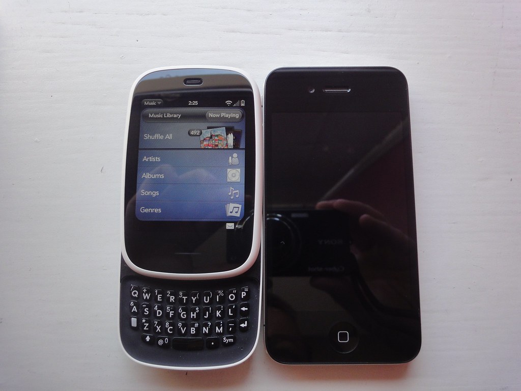
The keyboard isn't visible at all times. Instead, it is revealed by a sliding mechanism. I have never owned a sliding phone (although I did play with one a year ago), so it was definitely a change to have a slider on the Veer. In general, I found the sliding mechanism to be smooth, and when the phone was extended, it felt solid, with no wiggle or flex between the two halves of the phone. When extended, the Veer is almost as tall as my iPhone 4:
One thing that I don't like about the slider, however, is that it's hard to open with one hand. You can place your thumb in the middle of the screen and slide up, but that will register as a tap, which could have some unintended consequence in whatever app you have open at the time. The best way that I found to slide out the keyboard is to use two hands, which isn't always possible. This can be annoying if you start out with the slider closed, but bump into something require text input. Having to dork around, sliding the phone open, doesn't feel as efficient as an on-screen keyboard popping into view.
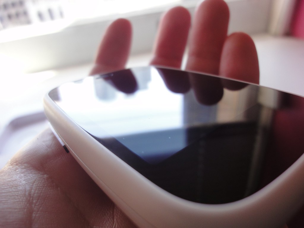
The screen is decent — text is readable, and when viewed head on, it is bright with decent color saturation. When viewed from the side, however, I was less impressed with the colors and brightness. I don't think that the display is IPS. It certainly isn't as high quality as the displays on the iPhone & iPad. One odd thing — with the display off, if you view it at an extreme angle, you can actually see some evenly spaced dots embedded in the plastic covering the display:
I assume that these dots are the touch sensors. The touch sensitivity was decent — it didn't feel as good as the iPhone, but it certainly got the job done.
In my testing, I found that the Veer's battery life was pretty good. The phone easily went 24 hours, with the screen brightness at 50%, and under moderate use — taking photos, playing with apps, browsing, watching video, listening to music, etc. I didn't do much talking on the phone, and most of the network access was over WiFi. It takes about 4 hours to fully charge the sealed-in battery. I would say that this is fairly impressive: given how small the phone is, the battery can't be very big. I also had email and twitter in the background at all times, fetching new data. I could probably extend battery life by disabling that (which is how I normally run my iPhone).
A few more odds and ends about the hardware: the placement of the sleep/wake button is a little strange. I think it should actually be where the mute switch is, but what do I know? You have to reach with your finger to a slightly odd position in order to trigger the sleep/wake button, but I did get used to it. The volume controls, while easy enough to trigger, are completely unlabeled. Once you fool around with that silver strip on the left side of the phone, you figure out what it does, but it seems odd to not at least have an indication of what is volume up vs. volume down.
All-in-all, up until this point in my review, you're probably thinking that the Veer, hardware wise, is a decent device. And you would be right, in that I haven't yet gotten to the must frustrating, mystifying, and "what were they thinking?!?!" part of the Veer.
The Headphone Jack:
Due to the small size and sliding form factor, HP wasn't able to add a standard 3.5mm headphone jack to the Veer.
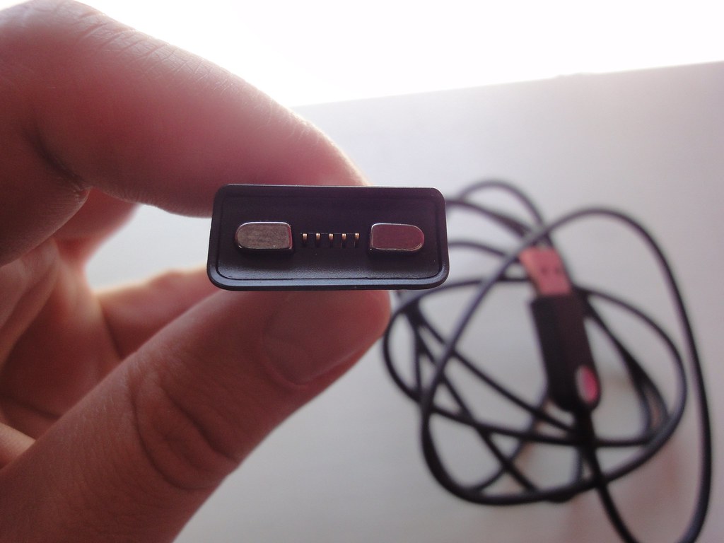
Let me repeat that again for affect: the Veer lacks a standard headphone jack. However, HP did add an "accessory connector", which functions a lot like the MagSafe connector on modern MacBooks. Here is what a connector looks like:
Notice the two magnets, with some contact pins in the middle. And here is what the socket looks like on the side of the Veer (image courtesy of thisismynext.com).
Now in theory, this might not be such a bad thing. HP supplies a USB cable (for charging and syncing), and a little adapter, that contains a 3.5mm headphone jack.
So, problem solved, right?
I wish.
The Veer's 3.5mm headphone adapter is inadequate in several ways. It attaches to the side of the phone, magnetically. And it shares this port with the USB charging cable. So if you want to charge your phone, and use your favorite headphones to listen to some music? Sorry, you're out of luck. And due to the novel location, instead of your headphone wire extending from the top or bottom of the device, it protrudes from the middle of the right side. Further, when I attempted to use my iPhone headphones, I found that I couldn't hear any audio if I plugged them in all of the way. Instead, I had to leave the headphones slightly unplugged, in order to get any sound. And this was the best experience that I was able to achieve.
The main pair of headphones that I use while wandering the streets of San Francisco are a pair of Shure SE315's. These are in-ear headphones, meant to create a seal in your ear, blocking outside noise (something that's essential in a noisy city). My last pair of in-ear headphones experienced cable failure, where the headphone wire meets the 3.5mm connector. So with my new pair, I made sure to buy something that had an extra-sturdy connector. In the SE315's case, Shure added a 90 degree angle to the connector, as well as some added thickness to ensure a robust and sturdy connection to your chosen device. And now, coupled with the Veer's bizarre headphone adapter, I have two problems:
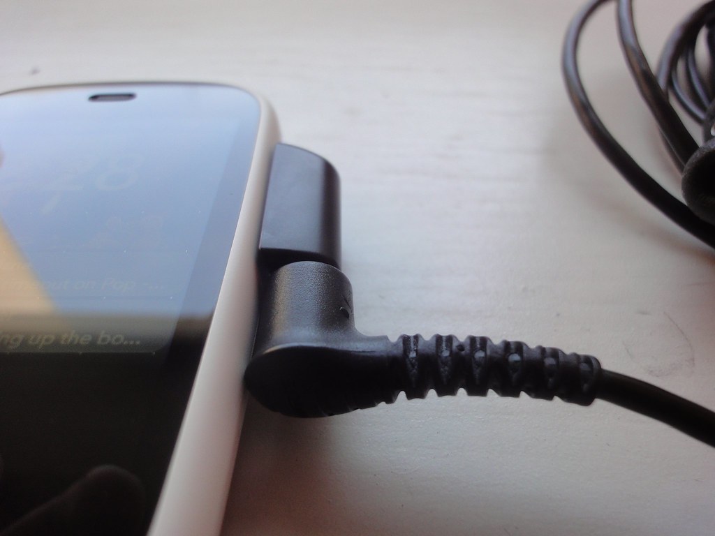
The first, and most obvious problem, is that due to the 90-degree angle, the headphone cord juts out from the phone, in a way that makes it really difficult to carry in your pocket. The way that I have it angled in the above photo is actually the best — when closed, the Veer is short enough, that it might be able to fit perpendicular to the ground in your jeans pocket. This would leave the headphone cable pointing straight up, which would likely work.
But there is another, more subtle, problem. The Shure headphone connector is much thicker than the iPhone headphone connector, and it actually bumps up against the side of the Veer. In fact, it actually is thick enough to slightly push the Veer's headphone adapter away from the socket. Remember how I said that Veer's adapter is held on via magnets? That means that with just a bit of force, it's possible to pop the adapter off the phone, or in this case make it slightly loose. And of course a loose adapter means a poor connection — I heard scratches, pops, and other interference when using my headphones in this manner.
What this all means is that if you intend to use your phone for any of the following activities: listening to music, listening to podcasts, listening to audio books, watching YouTube videos, watching movies, or playing games, and you wish to do these things in private, then I strongly recommend staying FAR away from the Veer. And for me, listening to music is one of the things that I use my phone for the most, so I found this aspect of the Veer to be a real deal-breaker, leading me to come up with contorted solutions to attempt to listen to anything at all in a comfortable manner.
webOS:
This was my first time really getting to play with webOS, and was the main reason why I wanted to get my hands on this phone. And after a few intense days of screwing around, I can safely say that the things I've read about webOS are true: it is very, very good.
For most people, a modern smart phone is all about the applications that it can run. So I'm going to start with a brief tour through the apps that I played with, and then wrap up with some more general commentary about the OS.
App Catalog — seemed to be a serviceable app store. It is fairly easy to find apps, downloading & installing happens nicely in the background. The payment process is cumbersome the first time (inputting your credit card info, etc. is a pain on a small keyboard), but subsequent buys were one click, just like on iOS.
Web — not quite as good as Mobile Safari, but very good. Due to the small size of the screen, some web pages were hard to read without having to do a lot of resizing and panning. But mobile-optimized pages are totally readable (including this blog after I added the Veer's user agent string to the list that get the mobile optimized version). The card metaphor, central to webOS, also works quite well with the Web browser. If you click a link from a different application (like Mail, Messages, etc.), an instance of the web browser will open in another card. But this card will be associated with the spawning application, resulting in a "stack" of cards. This is a relatively new feature, that doesn't sound all that important, but was incredibly cool to use in practice.
The web browser also supports Adobe flash, right out of the box. I didn't spend a lot of time testing this, but I found that it did work... sortof. Flash files embedded in web pages did generally load, and it was possible to do things like watch video, or visit that flash-only website for a restaurant. But performance was so terrible as to render the Flash-enabled web page unusable in most cases. I continue to see devices that have Flash as having a bug, not a feature.
Email — In general, mail on the Veer is as Joshua Topolsky said — incredibly slow at times. After all of your mail gets downloaded, the application is reasonably responsive. But until then, it's almost unusable. I also saw tons more lag when dealing with attachments. PDFs would load, but if I multitasked-away, the PDF card was usually hung when I came back. I tried viewing a word document in Quickoffice, and that seemed to work well. It looked like Quickoffice was actually reflowing the text in the document, to make it more readable on the small screen. However, it wanted me to register my email address... what's up with that? Finally, I couldn't copy text out of the email application. I'm not saying that this is impossible, just that in my limited time with the Veer, I couldn't figure it olut. And webOS doesn't have data detectors either, so when I wanted to map an address that someone had sent to me in e-mail, I was rather stuck.
Calendar — is pretty awesome. Leveraging Synergy, the Calendar app sucked in all of my cloud calendars, allowing me to see my schedule in an efficient way. In my short time with the webOS Calendar, I found it to be much better than iCal on iOS.
Messaging — I didn't play with this too much. Due to Synergy, webOS managed to fetch all of my Google Talk contacts, but even after adding my AIM account, I couldn't get that to work. It seems like unifying SMS and IM conversations into one app could be a powerful idea, but it's something that I didn't have time to explore.
Phone — seemed to be a perfectly serviceable dialer. It didn't appear possible to be able to copy phone numbers out of this app (which is possible on iOS). One nice thing — webOS synergy grabs contacts from everywhere (Facebook, Google, LinkedIn, etc). So you get up-to-date phone numbers, as well as photos of people. The photos, in particular, were a pleasant surprise. It made the Veer feel like it was "my" phone, even though I didn't spend a ton of time adding photos to contacts in my address book.
Camera — I found this application to be simple, but effective. The number one thing that you want from a camera app is responsiveness, and I found the Veer's app to deliver. There wasn't much lag between shooting a photo and being ready to take another one. One add thing, was that there isn't good visual feedback — I sometimes found that I didn't know that I had pressed the button to take a photo. But that is probably something that I could get used to. In general, photos that I took outside looked fine (examples: one, two, three, four), while photos taken inside (even in decent light) seemed grainy (examples: one, two). Incidentally, iPhoto didn't recognize the Veer as a camera when I tethered it to my mac via USB — I had to manually copy photos off of the device.
Music — This is one of the most important aspects of any computing device that I use — I am way into listening to music. So, I'm happy to report that the webOS music app is pretty reasonable. It looks nice, and was able to get most of the metadata from the songs that I copied over from iTunes. There was some missing album art, but presumably this is something that I could fix if I tried. The sync experience isn't fancy, but it gets the job done. When tethering the Veer via USB, it pops up a notification asking if you want to charge, or become a USB drive. When the phone is in "USB drive" mode, you cannot receive calls/texts, or generally use it at all (it basically behaves as a USB thumb drive attached to your computer). But this then exposes the user-accessible parts of the file system, and you can copy files to and from the device.
Copying music or movies to any folder will be enough for the Veer to find them when you leave USB mode. The first time I did this, however, it was a little confusing. There were default folders for photos, wallpapers, ringtones, etc. But no default folder for music or movies. I created a "music" folder and a "movies" folder, and dragged files out of my iTunes Library onto the Veer. This worked fine, but presumably the folders could have any name (or you could not bother with a folder structure at all). It seems like this should be a bit more "on rails", and more obvious to the user. After copying, when you next launch the Music or Videos application, it will scan the internal storage in the Veer, and display all playable files that it could find.
Videos — worked fine for several iPhone-optimized movies that I copied over. It doesn't remember position in a video if you quit though, which is a killer for me. When on the go, I tend to watch longer video files in short sessions - 10 minutes here, 5 minutes there, etc. You can do this on the Veer, so long as you don't throw away the video card that you were watching. However, if you reboot, or toss the card, you'll have to start back at the beginning of the file. The iOS experience is superior here.
Clock — The UI for setting up new alarms is a little weird, but cool once you get used to it. The speaker in the back of the Veer was plenty loud to wake me up in the morning, so this little phone can definitely serve as an alarm clock.
YouTube — this app was merely functional, and didn't really blow me away.
Google Maps — seems to be on par with the iPhone. I think that the Google Maps application on recent versions of Android has more features, but for basic mapping, this seemed to be totally fine.
Amazon MP3 — seems like a decent music store. I didn't try buying anything.
Help — this was a pleasant surprise. webOS includes extensive on-device help, that was actually useful. I used this several times, to get on-device help with things like taking screenshots, and selecting text.
Aside from the individual applications, I was positive on the overall webOS experience. Generally speaking, I found that the speed of webOS on the Veer was fine (aside from in the Email app). But beyond that, the design is fantastic. What Palm/HP has done with webOS easily puts them on the same level as what Apple has done with iOS. And in some instances, webOS is actually ahead.
Multitasking is just great on webOS. The card UI is fluid and expressive. I found that I multitasked a lot more than I did on iOS, and it felt a lot more fun. There is no home button. To get to the card UI, you swipe up from below the screen. When reading about webOS, I assumed that this gesture wouldn't work as well as having a physical button. But after only a few days with the Veer, I became convinced — the swipe up gesture is well implemented, and feels easier to trigger than double-tapping the home button. There have been rumors that an upcoming iPhone will receive a capactive home button, which I've been fairly dismissive of. But based on my experience with the Veer, I think that it could work, provided it was less of a button, and more of a gesture.
The gesture area below the screen isn't 100% perfect, however. HP also includes a "back" gesture — swipe from right to left, and you'll go back in the currently running application, or to back to the home screen. This is similar to the back button in Android, and while I know that there are lots of people that like this, I am not a fan. In my use, there were many times when I swiped back, and wasn't sure what I'd be going back to. I had to learn not only the gesture, but also what it would trigger in the specific application that I was in. I found this lack-of-obviousness to be frustrating.
In a similar vein, webOS applications tend to hide a lot of functionality in the "application menu", at the upper-left of the screen. This menu appears as a button, with the name of the running application. This is similar to the menu button on Android, where app developers can drop in all of the functionality that they couldn't figure out how to fit into the normal flow of their application. I felt like I had to hunt around in that menu for every application that I ran, to determine if there was any important functionality in there. Again, I prefer Apple's approach with iOS, where they force developers to put all of the important functionality within the app itself. If you can see it, you can know it's there, and touch it to get a response.
Finally, I never got the hang of selecting text in webOS. The text selection system uses touch events, combined with the keyboard, in order to highlight text, and then do the usual cut/copy/paste operations. Using the on-device help, I was able to perform some basic text manipulations, but I never felt comfortable with it. I found that positioning the cursor, in particular, was challenging. I really missed the iOS loupe tool. This wasn't really a dealbreaker for me, but it's something that will merit further investigation, the next time I get to play with a webOS device.
Third Party Apps:
One of the big knocks against non-iOS platforms is the quantity, and quality, of the apps. So, in the name of science, I downloaded a few apps from the "App Market" (even going so far as to pay for a few). Here is my rundown of the few apps that I had time to play with:
Carbon — a decent twitter app for $2. I liked it — the UI was responsive (it was impressively fast when scrolling a long list of tweets), and it has all of the features that I need. And because webOS notifications rock, it's okay to let it run in the background, polling for tweets. I could definitely see this as being my full-time mobile twitter app. The only thing that I missed was viewing who has responded to tweets. However, one of my new favorite pastimes on Twitter, viewing conversations, worked well. All-in-all, I was impressed with this app.
Here is a screen shot of Carbon in action:
drPodder — Podcast app, $1. Klunky UI, didn't have any 5by5 shows in the directory. I managed to input a feed URL for a specific podcast, and it was able recognize the metadata. I downloaded an episode of Hypercritical and listened — app was functional, but I wasn't super in love with it.
Pandora — worked about as well as on iOS, but there were a few crashes. One nice feature was that using the elegant webOS notifications system, Pandora could display the artist and track title at the bottom of the screen, when starting a new song. I find that when using Pandora on iOS, I frequently have to switch back and forth, to know what artist I'm listening to.
Engadget — worked well, and the performance was acceptable.
Spare Time — Instapaper reader, $2. Fairly bare bones, but worked well to catch up on my saved Instapaper articles. It's great to see this, as Instapaper is one of the things that I would really miss if I were to defect from iOS.
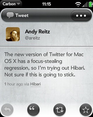
The Carbon Twitter client, running on the HP Veer
All told, I didn't find the common claim (that webOS "has no apps") to be true. There is definitely a vibrant 3rd party application ecosystem on webOS, and in my short time with the Veer, I didn't encounter any apps that refused to run due to the small screen size. But this is not to say, however, that availability of apps on webOS approaches anything like what is available on iOS, or even Android. And while it seems like HP might be able to turn this situation around, there are signs of trouble. The long time between new phone models, coupled with the lack of a phone that has been a huge hit, could mean that support is waning. For example, the developer of Spare Time, Darren Holst, has announced that he is ceasing webOS development, essentially due to a lack of faith in the platform. And there is no quick fix for assuaging developers concerns. HP simply needs to get more devices in the hands of consumers. Which is a bi of a chicken-and-an-egg problem, if you are a consumer pondering buying an HP phone, and one of your concerns is the health of the App Market.
Conclusion:
I like webOS, more than I thought I would, in point of fact. GeekSugar had to practically pry the Veer out of my hand, in order to return it before the deadline (it was just a review unit, after all), because I was enjoying tinkering with webOS so much. Yet while I appreciate what webOS brings to the table, and I hope that it finds a strong place in the market, in order to offer competition with Apple and iOS, I'm not naive. It seems like HP, and Palm before them, doesn't consider a new product to be done until it has some glaring, head-slapping, I-can't-believe-they-shipped-this flaw baked in. And for the Veer, that flaw is the headphone jack. I suppose there are people in the market for a smartphone who will never, ever listen to any sort of music/spoken word/video/etc. on their phone. And if you are one of those people that knows this ahead of time, then maybe the Veer is for you. But I think that never is a strong word, and most people assume that it's easy to listen to music on a smartphone.
And so it goes. HP/Palm desperately needs a hit. And I don't think the Veer is going to be it. My guess is that the sales will be modest, and we will soon see this phone heavily discounted on AT&T (down from it's initial $100 price). Here is hoping that the upcoming Pre 3 is the hit that HP needs.
-Andy.
