Google is aggressively trying to court developers to come over to their Android platform, and as an indirect result of this effort, I ended up with a Motorola DROID phone for the weekend. And so I played with it like crazy, and took notes along the way. But before I really get into it, let's start with what I liked:
- The screen — it's 3.7" and 480 x 854 pixels of LCD glory. Text is razor-sharp, and looks gorgeous.
- The speaker — amazingly loud, without sacrificing clarity.
- Google Navigation — coupled with voice recognition, I was able to say "Navigate to the nearest In 'N Out", and with a minimal amount of interaction (I had to confirm that it understood me properly, and choose which In 'N Out that I wanted), I was on my way. Coupled with the loud speaker, I could leave the DROID in my cup holder, and could still hear it as I drove.
- And of course, the data network from Verizon is "above reproach".
And while I had read a lot of the above on the 'net before I got a chance to play with the DROID extensively, what I was really curious about was Android's built-in ability to act as an iPod. As I wrote earlier in the year, the iPod application is the single most-used feature of my iPhone, so it's pretty important to me.
Android 2.0 ships with an application called "Music". Here's what it looks like after you fire it up:
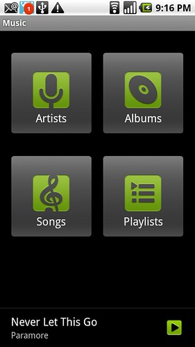
"Music" application home screen
But of course, before you can actually listen to anything, you have to get some music on the phone. Most Android devices store media on some sort of SD card. In the DROID's case, the loaner phone that I had contained a 16GB micro SD card. So, I used the supplied USB cable to connect the phone to my iMac, assuming that I'd be able to drag some music files from my iMac's iTunes library over to the SD card on the DROID. However, after making the connection, the SD card didn't mount on my Mac.
Some amount of fumbling around later, and I figured out how to access the notifications area on Android:

"USB Connected" message in the notification area
Once you click on that USB message, then the SD card on the DROID will mount on your computer. With that hurdle passed, I proceeded to drag about 5 GB of music and 8 GB of movies from my iTunes repository to the SD card on the DROID. So, now I could actually have some music:
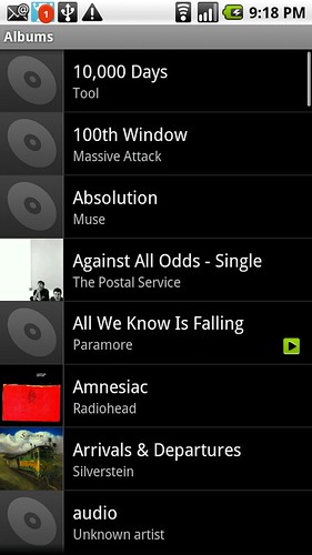
And immediately, you should start to see some of the problems. While all of my music behaves properly in iTunes -- there is album art, proper metadata, etc. A lot of that extra information didn't make it over to the DROID. And if you're at all anal about your music, as I am, this can make things rather maddening. I still listen to music in album form, so it matters to me not only that songs are associated with the proper album, but that they come in the right order. Hence, stuff like this would drive me bonkers if I had to deal with it on a daily basis:
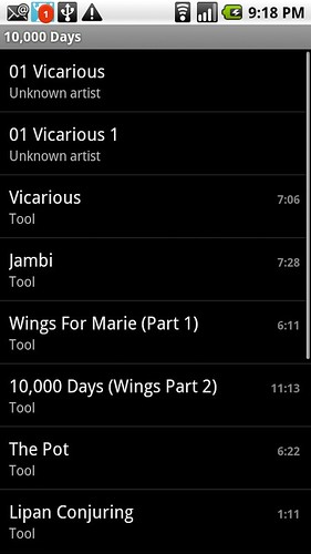
10,000 Days, plus a little extra, on Android
It seems like this is a known issue — I saw lots of apps in the Market that purported to find missing album art, or fill in other metadata. I'm not sure if that is the right way to go about solving the problem. Other than the metadata issues, the Music application seemed to get the job done — music played in the background, and I was able to use the iPhone remote (the button built into iPhone-compatible headphones) to pause music while the phone was in my pocket.
So next, it was off to view some video. And in this arena, the default Android experience was much, much worse. First off, I wasn't sure what application I should use in order to view movies that I had sync'd over. On the iPhone, the iPod app just takes care of everything (music, movies, podcasts). But on Android, a separate app is required. After some fumbling around, I found it, and it is called "Gallery". This application appears to be a grab bag for viewing all visual media (video, pictures) on the phone. When I first launched it after sync, the application appeared to lock up — the whole phone was unresponsive for several minutes. I put it down and did something else, and when I came back, it was working. I believe this delay was due to the application needing to scan the SD card, in order to determine what media to present. And once working, this is the main screen:
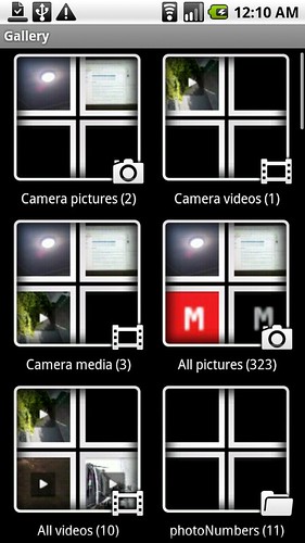
Main screen of the Android "Gallery" application
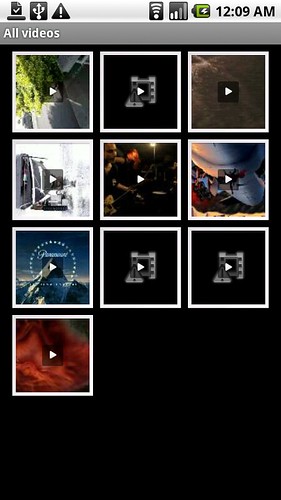
So, that's mildly ugly. The UI is trying to organize the available media into categories, and present a visual overview. I don't think it really works out, but I guess it was worth a shot. So, let's dive into the "All videos" category, shall we?
Wow, just, wow. Words fail me, as I attempt to describe how bad this is. Which movie is which? If I want to watch a particular movie, say "Away We Go", how would I pick that? Literally, this is all that there is. You can't tap and hold, use the menu key, or anything. You just have to guess, based upon a frame taken from the beginning of the video file. And if this presentation didn't waste enough space while presenting unhelpful information, it is also showing me 3 movies which the DROID cannot play. Which three movies? I have no clue, because I'm not able to watch them.
Now, to be fair, my iPhone encounters movies all the time that it refuses to play. But those movies never actually make it onto the device in the first place &mdash iTunes sees to that. This is an example of how part of Apple's ecosystem (in this case, iTunes) serves to make the experience of the phone stronger. And it's one of the many reasons why competing with Apple is so hard these days.
You can argue that this layout, while supremely inelegant, is still functional. And it's true that the Gallery application does support resuming video playback — if you stop watching a video before the end, Gallery will show a dialog when you next attempt to watch it, asking if you want to resume. On the iPhone, this is the implied default (and that is totally the way to go). My final comment on video playback on the DROID has to do with the 4 hardware buttons. Google mandates that every Android device must have 4 buttons: back, menu, home, and search. On the DROID, Motorola chose to make these touch elements instead of buttons. To make them usable in the dark, Motorola put a back-light behind them. Unfortunately, however, when watching a video in the dark, the lights behind these buttons are always turned on. This pulled me out of the movie watching experience — instead of focusing on the video, I was distracted by the bright buttons right beside the screen. It's how the DROID gets little details such as this that made using it a rather annoying experience, overall.
There is more that I could say, but the music and video experience was the main reason why I wanted to spend a weekend on DROID. And I don't see Android rivaling the superior attention to detail of the iPhone anytime soon.
For more on my Android experience, check out this gallery that I made on Flickr.
-Andy.
