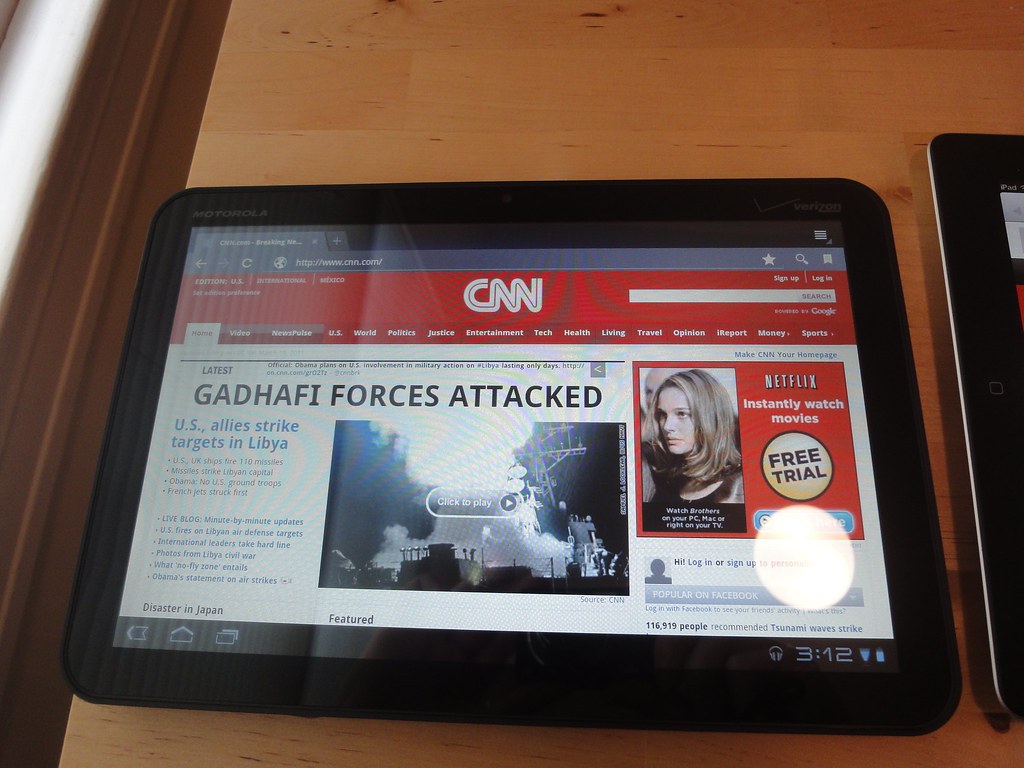
My company has a Motorola Xoom, the first Android Honeycomb tablet, on loan for a month, and I was lucky enough to snag it for a weekend:
In general, I'm impressed in how Google was able to adapt Android for the tablet format in such a short amount of time. However, I still found lots of problems with the Xoom, and in particular, Honeycomb, in my testing. In fact, there was so much that I could potentially write about, that I decided to focus my review on three specific areas: web browsing, music playback, and video playback. These are three of the activities that occupy a lot of my iPad time, so naturally, these were the activities that I was most interested in bringing to the Xoom. If you want a more complete rundown of the Xoom, check out Engadget's review (although I think Joshua Topolsky's score of 7 is way too high).
This post is pretty long, so all of the details are after the break. If you just want to look at pictures, a gallery is on Flickr. If you're looking for the tl;dr version, here it is: Unless you are an Android developer, or thinking of becoming one, you should avoid all Android Honeycomb tablets. With that being said, click on for my reasons why.
Browsing the web
The browser application on the Motorola Xoom is quite disappointing. In fact, the browser is my second biggest disappointment of the entire Honeycomb experience (I'll get to disappointment number one later). I consider web browsing to be one of the most important aspects of a tablet device. And you would expect that Google, a company born on the web, would make shipping a kick-ass browser in Honeycomb priority number one. But if you think that, you would be wrong.
But first, something good: the problems with the browser weren't due to performance. In general, I found that the browser performance was actually pretty good. Scrolling seemed fine, especially if there were no flash objects on the page. To my mind, the iPad "feels" a bit smoother when scrolling around in a webpage. However, when using both tablets side-by-side, I must admit that it was hard to discern any real difference in scrolling performance.
But unfortunately, performance aside, the Honeycomb browser has a multitude of problems. From websites that didn't load properly, to visual corruption, to a confusing interface — you name it, and the Honeycomb browser has it in spades.
The biggest issue, overall, is that the Browser uses the Android user agent string. This means that to websites, a Honeycomb device appears to be no different from any other Android device. And up to this point, the vast majority of Android devices have been phones, with small 3 - 4" screens. Thus, when surfing the web on the Xoom, you frequently get the mobile version of a website. On a large 10" tablet, this exactly the behavior that you don't want. You want to see the full website, not the stripped-down mobile version. Many websites provide the option to toggle between the desktop and mobile views. But the Honeycomb browser don't provide an option to toggle the user agent string. So, to get a high-fidelity web experience, you are stuck chasing down links to switch to the desktop experience an many sites. And of course, this is the opposite of the iPad, which just does the right thing with most websites.
I also noticed some bugs with the browser, including rendering oddities on Daring Fireball:
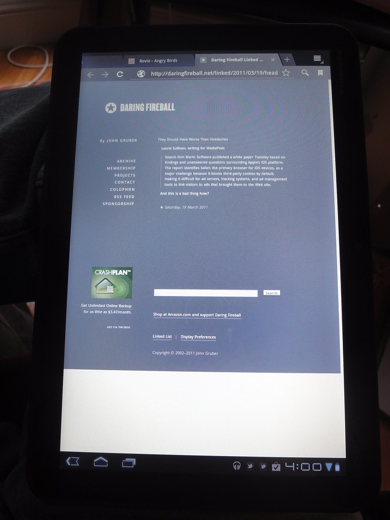
All of that white space on the bottom and right-side of the page is wrong.
Another issue, that I noticed several times, were instances where once the browser finished rendering the page, parts of it were "garbled". It was like some graphics were left over from the previous page, or some graphics were misplaced on the current page. Here is a video which highlights this issue:
Honeycomb Browser visual corruption bug.
Typically scrolling up and down resolved these issues, but the fix didn't stop it from being disconcerting. Yet another issue that I have with the Honeycomb browser is its penchant for re-flowing text when you zoom in. This video demonstrates the issue:
As you can see, the text jumps around a lot when double-tapping to zoom in. By design, the android browser likes to reflow text on zoom. However I noticed that when I zoomed back out the text was still flowed as if the webpage was zoomed in. It took some additional tapping around to get the text to reflow for the zoomed out view.
The final issue that I noticed was that occasionally, I encountered sites that didn't load properly. For example, I tried to watch this video on Vimeo, and got a page that said "loading", and that is where things stopped. I tried reloading the page, closing the tab and trying the load again in a new tab, but no dice. Eventually, I switched to the Dolphin HD browser, which was able to load the page, and play the video. However, after rebooting the Xoom, I tried to reproduce this problem, and couldn't.
And while I'm on the subject, I did find that the Dolphin HD browser was better in some respects than the default browser that ships with Honeycomb. It's possible to set the user agent string in Dolphin, so you will get the desktop version of websites by default. However the Dolphin HD user interface leaves much to be desired and has problems of its own. If I was serious about using Android, learning the quirks of Dolphin, and using it to surf the web, would probably be the way to go.
One final note about Adobe Flash. While I didn't make it a point to test the Flash 10.2 beta extensively, I did play with it a little. I watched some video on Vimeo, on CNN, and finally on Charlie Rose's website. The latter was probably the best case for Flash on a tablet — the videos that Charlie Rose provides are only available in Flash — there is no iPad version available.
One thing that I noticed was that many of the flash video players were meant for desktop use. This meant that some of the tap targets were quite small and very hard hit with my finger. For example on the CNN.com homepage, the button to make a video go into full-screen was very close to a link. This means that instead of making the video go full-screen as I desired, I instead clicked the link and went to a different page:
Honeycomb Flash 10.2 beta, trouble going to full screen.
The solution to this was to visit the homepage for the video, which was bigger, and provided an easier-to-hit full screen button. However, once I went full screen, I couldn't get any information about the video, pause it, or even jump back to non-full screen!
Honeycomb Flash 10.2 beta video performance.
But on the upside performance was generally acceptable, I didn't notice many dropped frames when watching video. And having Flash running didn't really bog down the Honeycomb Browser as much as I feared that it would. All things considered, I'm not sure that I consider having Flash on a tablet to be a win. Well, I guess it is if you're a Charlie Rose junkie.
Listening to music
The music application is vastly improved in Honeycomb. It now presents a 3D, coverflow-style view of all your music. It looks decent, and it's pretty easy to browse all of your music in order to find something to listen to. And once you select an album, the tracks are presented in a nice, clean visual style, making easy to select a particular track, or just view the details of the album. You can even manage playlists on-the-fly. And once you begin playback of a song, a little headphone icon goes into the notification area. This allows you to see what song is playing, and modify playback at any given time:
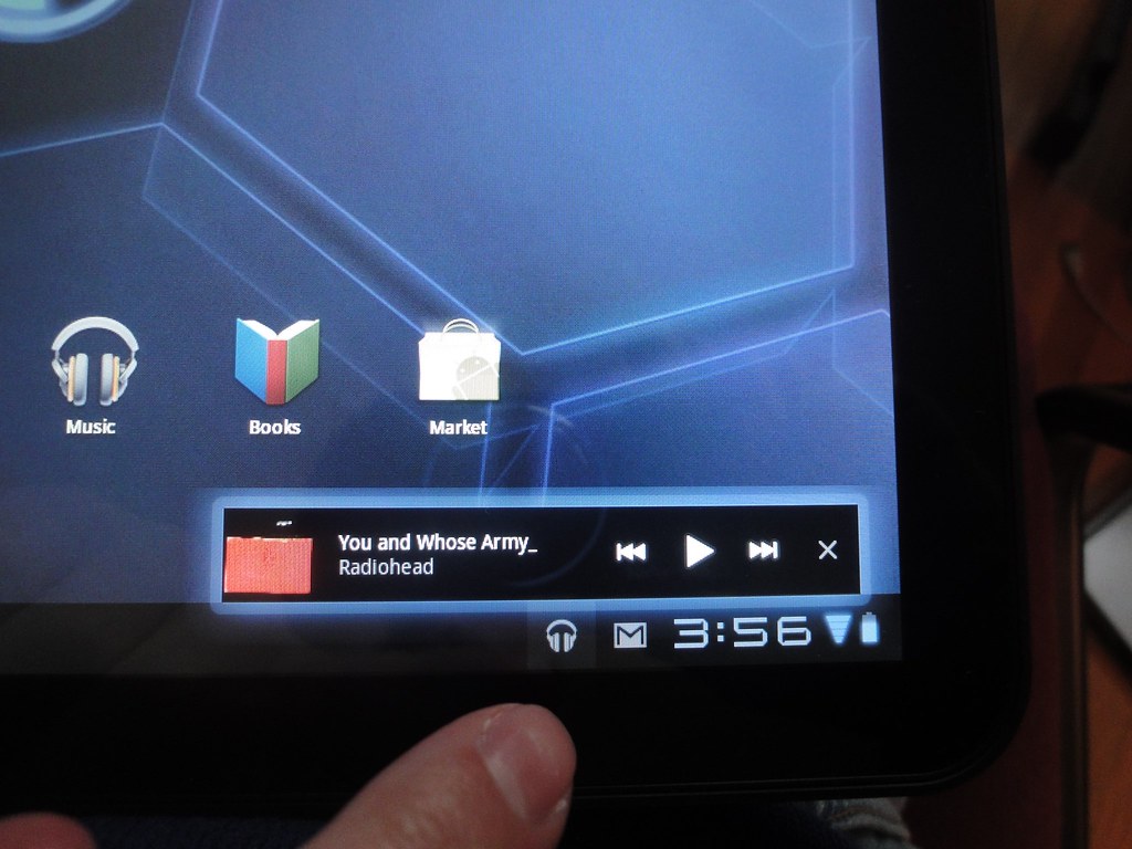
Tapping on the little headphone icon brings up this dialog.
However, it's not all good news. The interface for getting media onto the Xoom isn't pretty. On the Macintosh, an application is required:
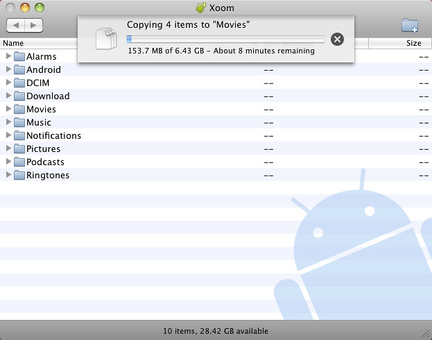
The "Android File Transfer" application, transferring some movie files to the Xoom.
This application is called Android File Transfer. Once you download, install, and launch the application, it presents a list of folders on the attached Xoom tablet. Using the Finder, you can drag-and-drop files in and out of these folders. However the list of folders isn't entirely obvious. Did you know the DCIM folder is where you retrieve photos taken on your Android tablet? What about the data folder? Or the android/data folder? Should regular users have to know what these folders are for? Should they be able to modify their contents? In general this interface is quite low level and will make it difficult for regular users to transfer media files to and from their device. However, once you get things going, the transfer does occur quickly, and all of the media that I put on the Xoom was recognized by Android once the transfer finished.
Watching video
And finally we come to watching video, one of the activities that I use my iPad for the most. And here, Android Honeycomb running on the Motorola Xoom is a real disaster. In order to watch a video that you have copied to your Xoom, you have to launch the gallery application. Once you launch this application, you're presented with two pictures: one which lists all the photos on the device, and the second which represents all of the videos on device. Once you tap on the movies icon there's nice animation were all the movies on the device spread out into individual tap targets. Honeycomb doesn't make any attempt to show album art, instead it shows a random frame from the movie. However, there is no text anywhere on the screen. So it's difficult to decide which video file is which:
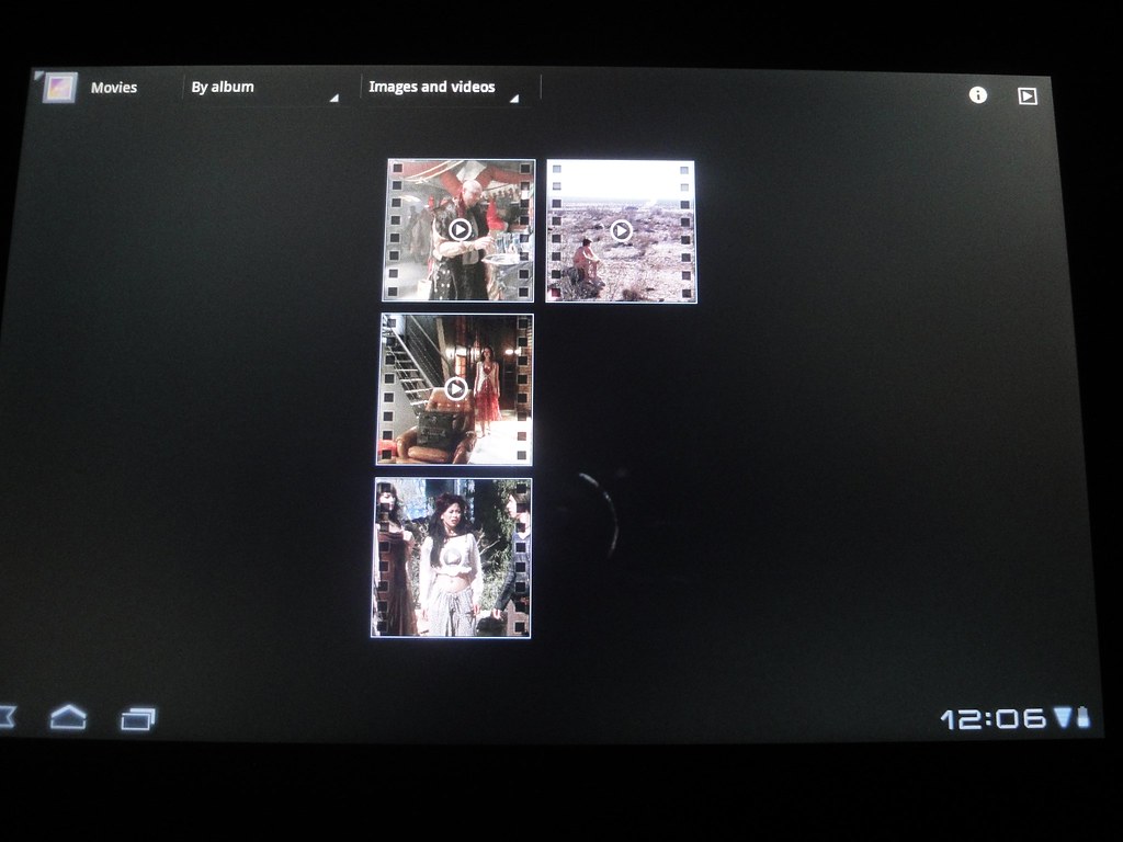
Which episode of "Firefly" would you like to watch?
If you know your videos well then you can probably ascertain which video is which from the given frame (and yes, I'm enough of a "Firefly" nerd that I can tell you which episode is which in the above photo). But if it is video you have never seen before then you're probably in trouble. There is an information button in the upper right, which gives you more information about the selected video. However, When you are in the information view, it isn't possible to actually play a video. You have to close the information window in order to be a play the desired video.
Additionally, If you drag your finger across the screen, the video stills will flutter a little bit, as if you could actually push them around. But this doesn't appear to do anything — you can't actually rearrange the videos on the screen. Google appears to have added these little visual flourishes throughout Honeycomb, but insofar as I can tell, they are basically pointless.
But all of this is just merely annoying. The real killer is that, even though the marketing materials for the Xoom advertise the fact that it can be used to play back HD video, in reality, it can't! I ripped my legally purchased Firefly Blu-Ray discs, and encoded each episode in 720p, using Handbrake. The resulting files are H.264, with 1280 x 720 resolution, and AAC audio. The framerate is 24fps. These files play just fine on my Mac, my iPhone 4, and on my iPad 2. However, the Xoom dropped frames like crazy, on every file that I tried. Video playback was so appalling, I went ahead and made a video of my own, to try and demonstrate the problem:
Motorola Xoom vs. iPad 2 HD playback.
But that's not all! On top of poor playback performance, I also managed to make the Gallery application crash. I selected a Firefly video, seeked to 30 minute mark, and again, the audio was fine, but the video was very stuttery. After some time, the gallery application crashed. I chose the "force quit" option, and the gallery application exited. However, the audio for the video was still playing... I changed apps, played an mp3 audio file, etc. but none of those things stopped the audio track from playing. Even putting the Xoom to sleep didn't stop the audio from playing! In the end, I had to reboot the Xoom in order to get the audio track to stop playing.
But that's still not all — I have even more complaints about watching video on the Xoom. When watching video in full-screen, the buttons at the bottom of the screen never fully disappear. In some applications, they will be reduced to faint dots, but they never totally go away. This is because you still need to be able to press the home button, for example, when you are watching a video. However, I found that having these buttons still showing was distracting, when I wanted to focus on the video. In addition, when watching video full-screen, tapping on the screen may pause the video or it may bring up the controls to interact with the video. Or, in some cases, it may do both! In general, the iPad is far more consistent in it's approach to playing video.
My final problem with watching video on Honeycomb isn't related to the mechanics of watching. Rather, another big problem is finding video content to watch on the Xoom. Even though the the Xoom has flash, many websites don't support showing their video content on a mobile device. For example videos that I attempted to play on Hulu would load, but then refuse to play. The error message indicated that Hulu wasn't authorized to show the content on my device. Netflix doesn't yet have an application for android devices. And the Netflix website uses a technology called Silverlight from Microsoft which is not compatible with Android. Blockbuster makes an Android application for renting movies, but it isn't available in the Android Market. Instead, Blockbuster approves their application on a per-device basis, and supplies pre-installed on devices. And of course, the Xoom isn't one of the pre-approved devices.
In all, I was unable to determine a way to rent movies, or view other commercial video content on the Xoom. Basically, if you want to watch video on this thing, you are stuck with YouTube.
Conclusion
If you read this entire review, you probably think that I'm predisposed to hating Android. I would like to think that such a notion isn't the case. In fact, I would strongly prefer it if there were one or two strong competitors to Apple in the phone and tablet spaces. When I think about the work-in-progress that is Android Honeycomb, and my somewhat negative reaction to it, I think I'm predisposed to disliking experiences that aren't polished. And that is largely what Honeycomb is at this stage — a mobile operating system that shows potential, but needs a ton of refinement. As to whether-or-not Google will be able to apply an Apple-level of polish over time, I cannot say. What I can say, however, is that spending 48 hours with a Xoom has really made me appreciate my iPad more. Everything about the iPad just exudes attention to detail, which is nearly the polar opposite of the experience of using Honeycomb.
If you are an Android developer, or thinking of becoming one, or just someone who likes tinkering around with computers, then maybe the Xoom is worth a look. For everyone else, either get a laptop, or an iPad. You'll be a whole lot happier.
-Andy.
