June 23, 2007
Foo Camp: End-User Databases
Really should have been called "Ending Rampant Spreadsheet Abuse".
There are a bunch of reasons people start off with spreadsheets. Even when they hit the limitations of a spreadsheet, they don't migrate to something like File Maker.
What can we learn from spreadsheets? Very focused on entering the data. Don't need to build a model first - instant satisfaction.
Refactoring data models - what starts as a text field needs to become a list (can we smoothly let them do that?)
Excel allows mixing data types in a column - a lot more flexible.
Databases focus on table and form views. There are other views that user might want. Richer visualizations (calendar, maps, charts, etc), inferred from types.
Typing can be explicit, or like Zimbra (& OS X Leopard), software can guess at types (phone numbers, addresses, etc.). Instead of making it totally automatic, putting a UI over it might make sense.
Dabble DB is a product that implements some of these ideas.

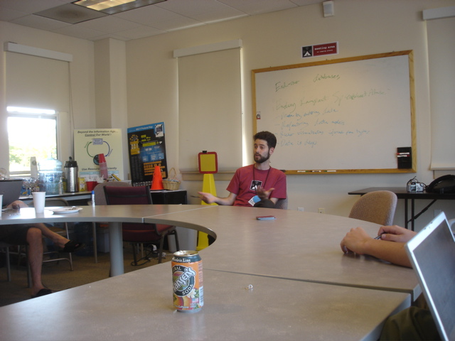
Avi Bryant making a point at Foo Camp
Templates? If someone uses a template for project management, they have a bad experience (worse than basecamp). Yet if they build the same thing from scratch, they get all their data where they want, they own it, etc.
Users that don't power-use Excel (don't use pivot tables), can do more with same level in Dabble.
Finding that they have good experience for person who sets up the DB, but poor for people that come in later and look at it (education/understanding). Using someone else's spreadsheet is horrible, also hard with someone else's database.
90% of the userbase can't grok abstractions. So, you either need to avoid them (by giving these users explicit, canned applications), or hide the building of abstractions (example: typing months in Excel, then dragging and having Excel fill in the rest).
Distinguish between creating a field and adding a column - make user create everything, so that they understand that when they build a view, it is just a window on their data.
Comparisons with JotSpot - they designed for 100's of items, average # of items in a Dabble DB is 2000. Make different design decisions based upon how big it will get.
The abuse -- big problems around collaboration. Multiple users editing, viewing in different ways, exposing different slices of data to different users.
Access control is a huge problem -- something they have struggled with. Tested 4 different iterations, and not released any of them due to issues. People want it to be magic. A lot of different implications when you setup a policy (thinking through is hard), UI for setting controls is hard.
People understand playlists vs. smart playlists. Smart playlists are basically a view ontop of your music library, and people can understand it. Not sure how many users actually create their own smart playlists, though...